The Price of War
This interactive visualizations was a project done by Maaria Assami as
part of the Design Studio 2 class in the Information Design and
Visualization MFA program during the Spring 2016 semester under the
instruction of Pedro Cruz. It captures the grim history surrounding the
different interstate wars that took place between 1823 and 2003, and
the blood price and casualties that was paid due to each war.
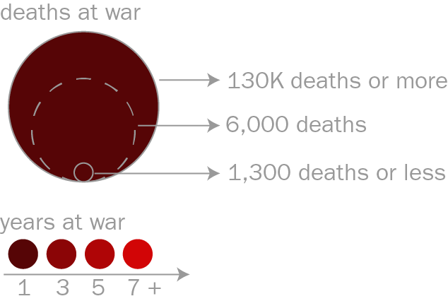
After hovering over the desired timeframe on the timeline, you will see the
number of wars that were fought during that period. The bloodier the
time period, the more the drop fills up with circles. Each circle represents a
war with it’s area being the number of casualties, and it’s color being the
duration of the war. You can then hover over the different circles to explore
more about the wars the different circles represent.
Data source: www.correlatesofwar.org